Kaizen Food Company
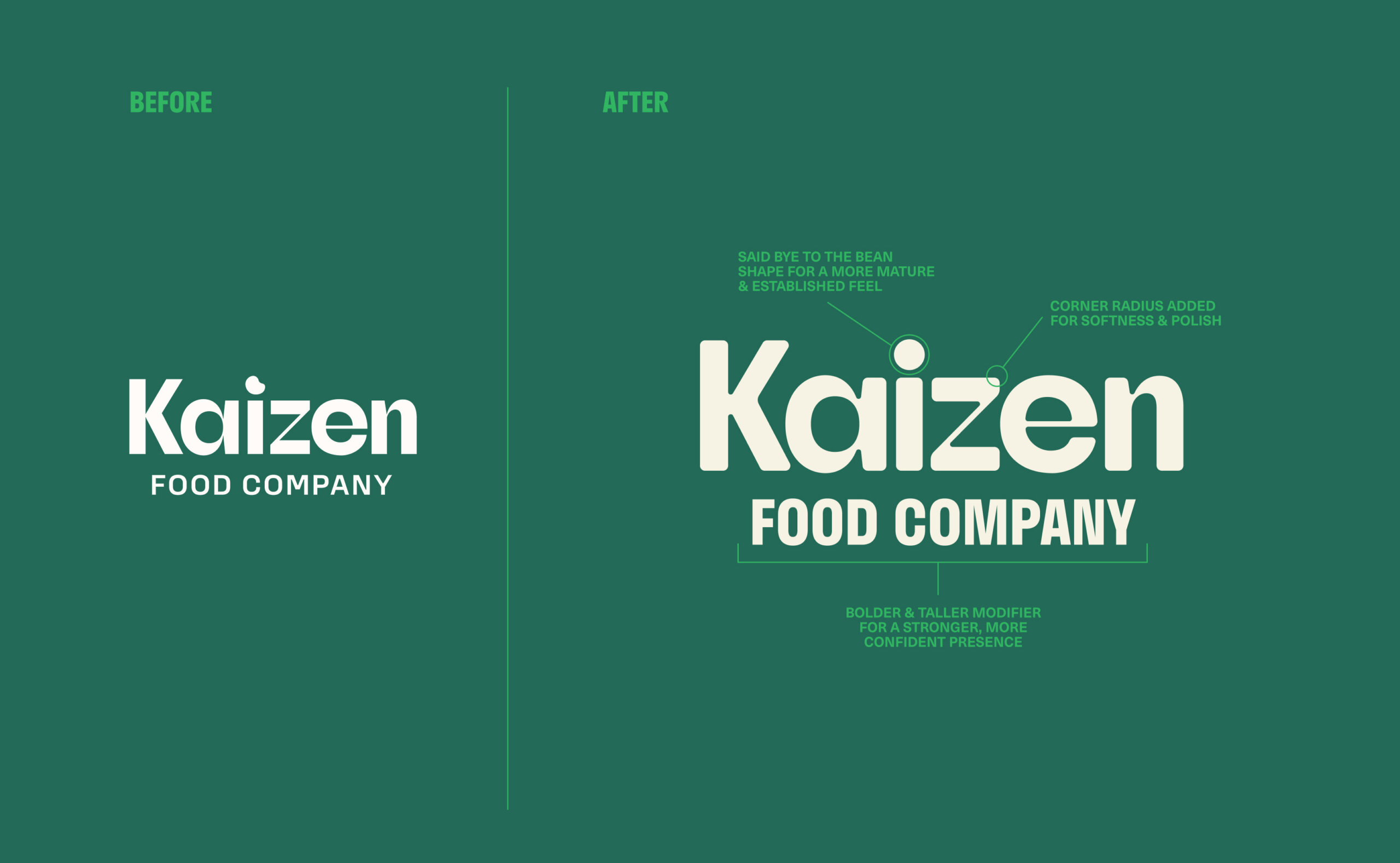
Kaizen Foods Co. is a lupini bean-based food brand that empowers you to enjoy comfort foods without compromise.
- Visual Identity
- Collateral Development
- Package Design
Our Process
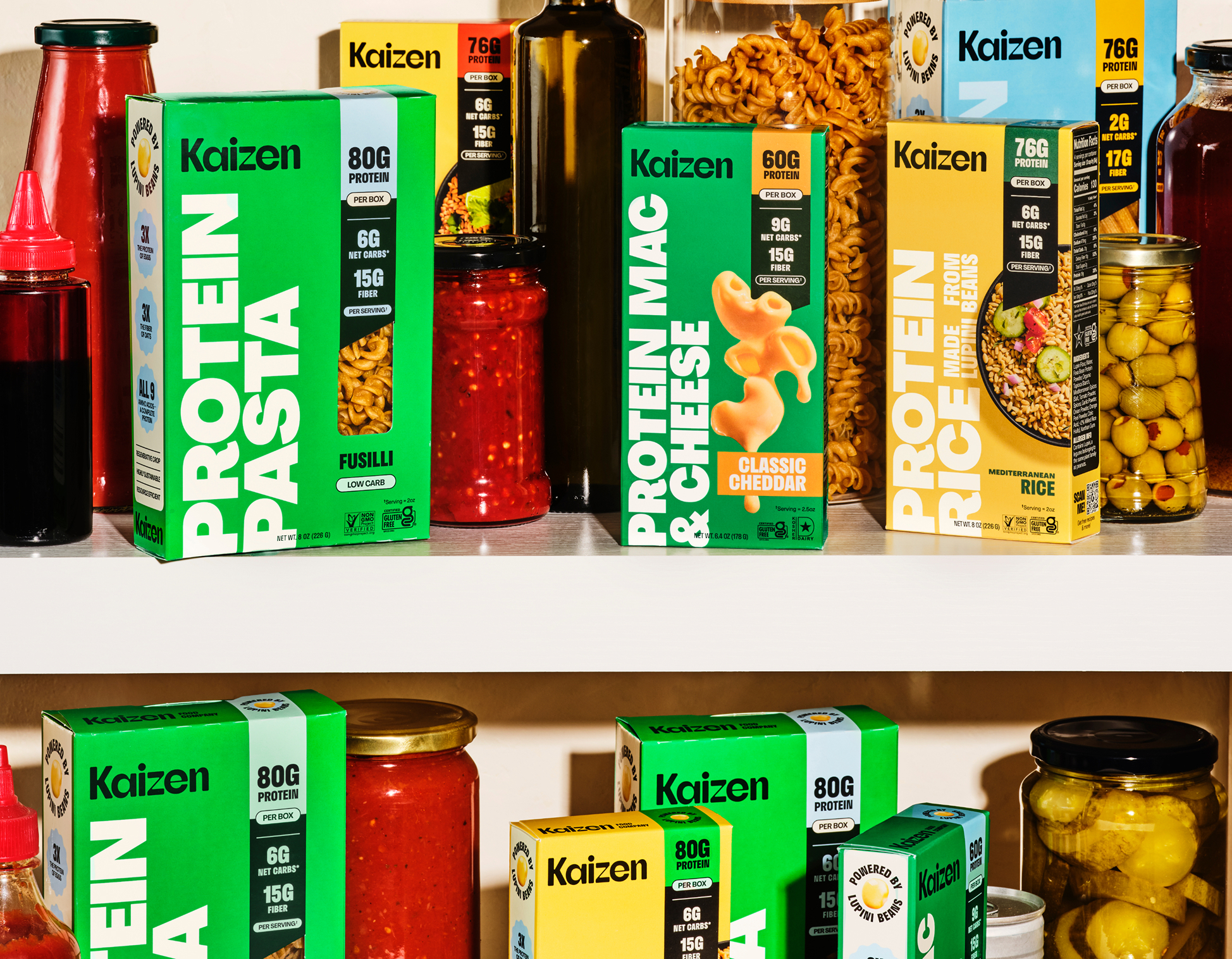
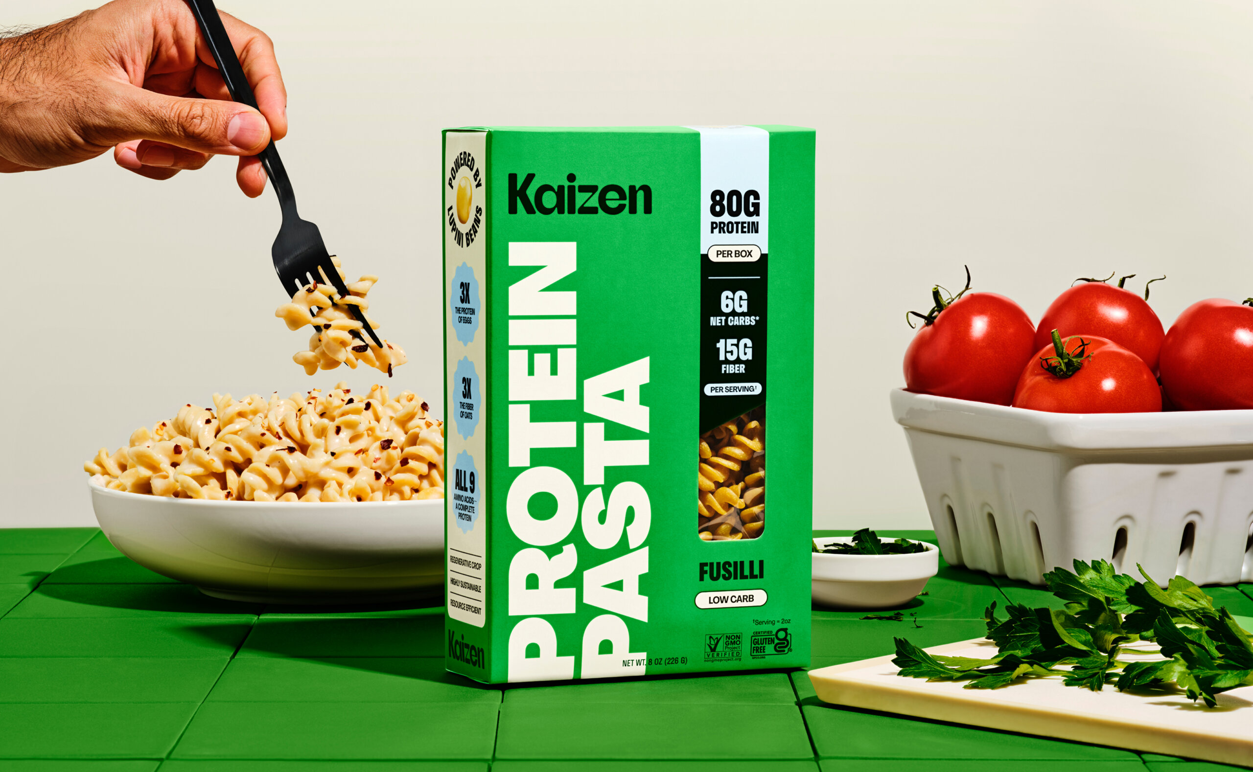
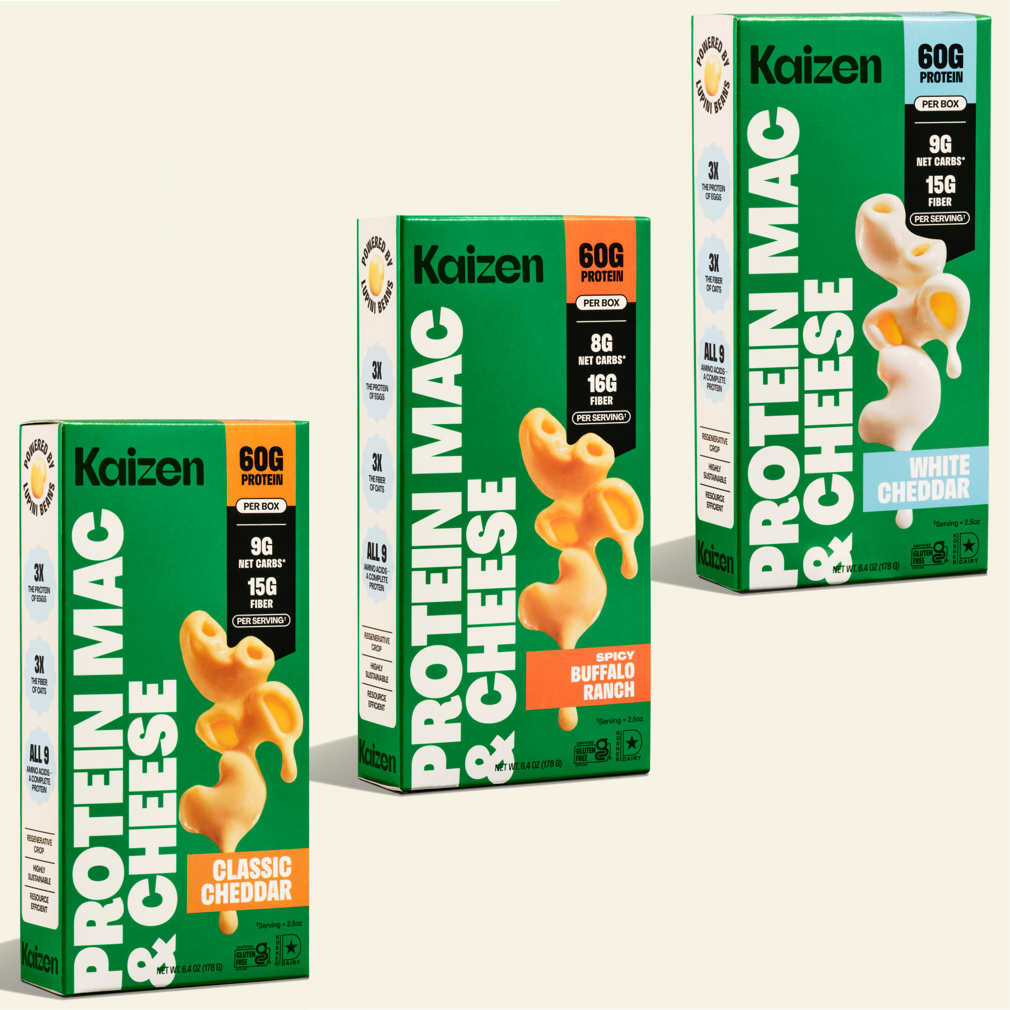
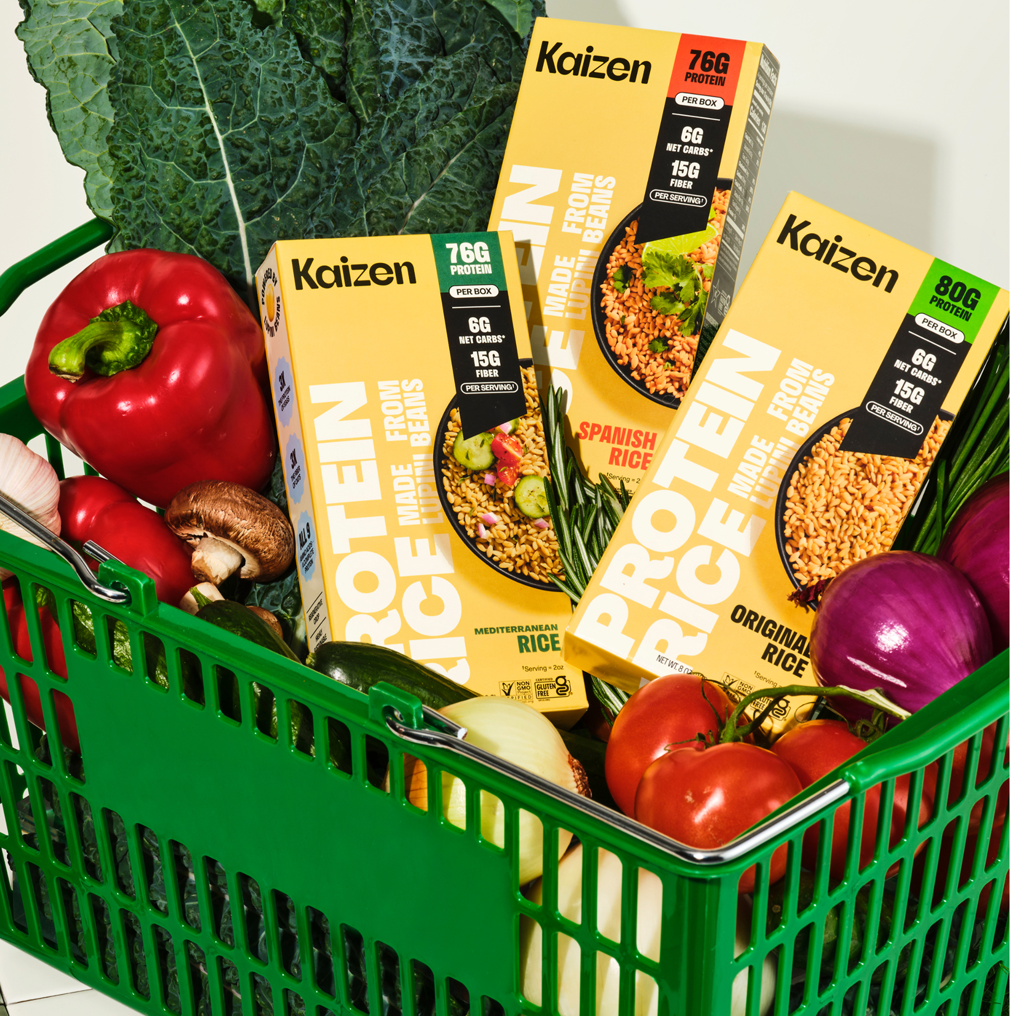
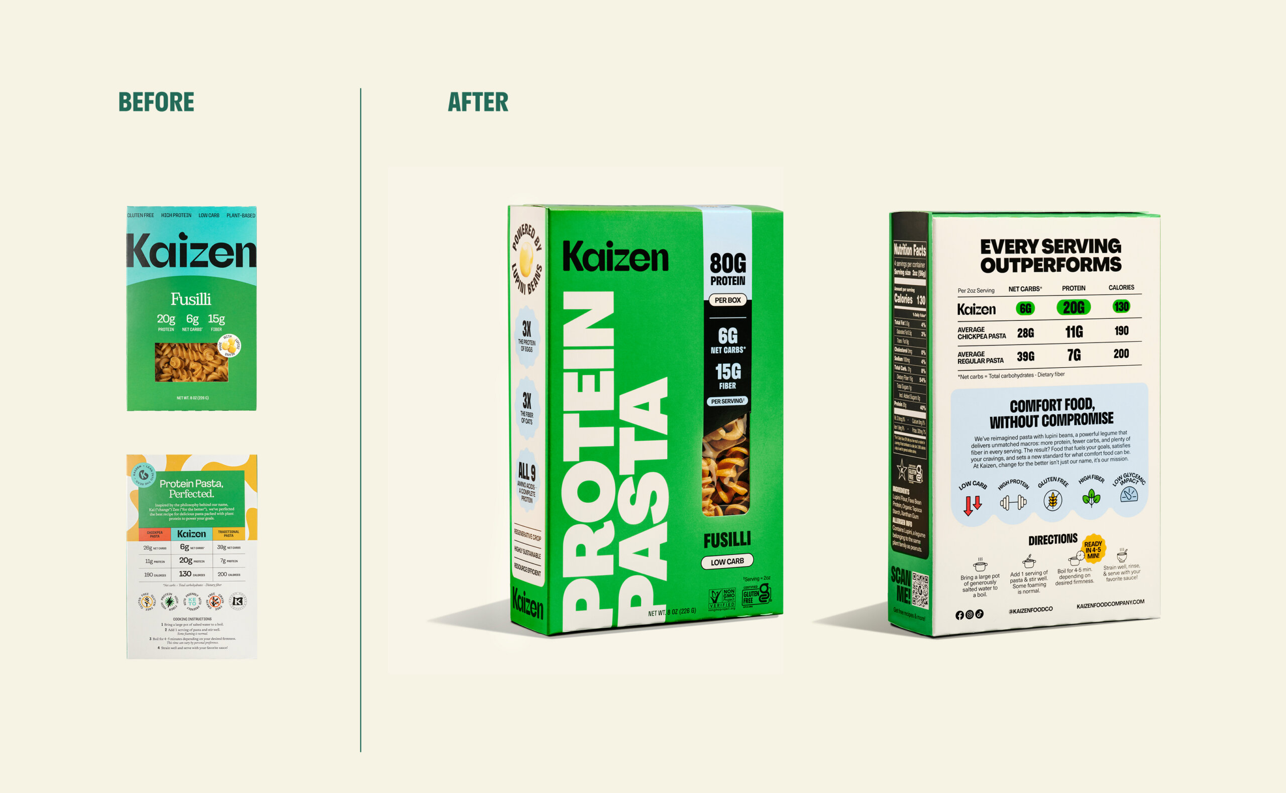
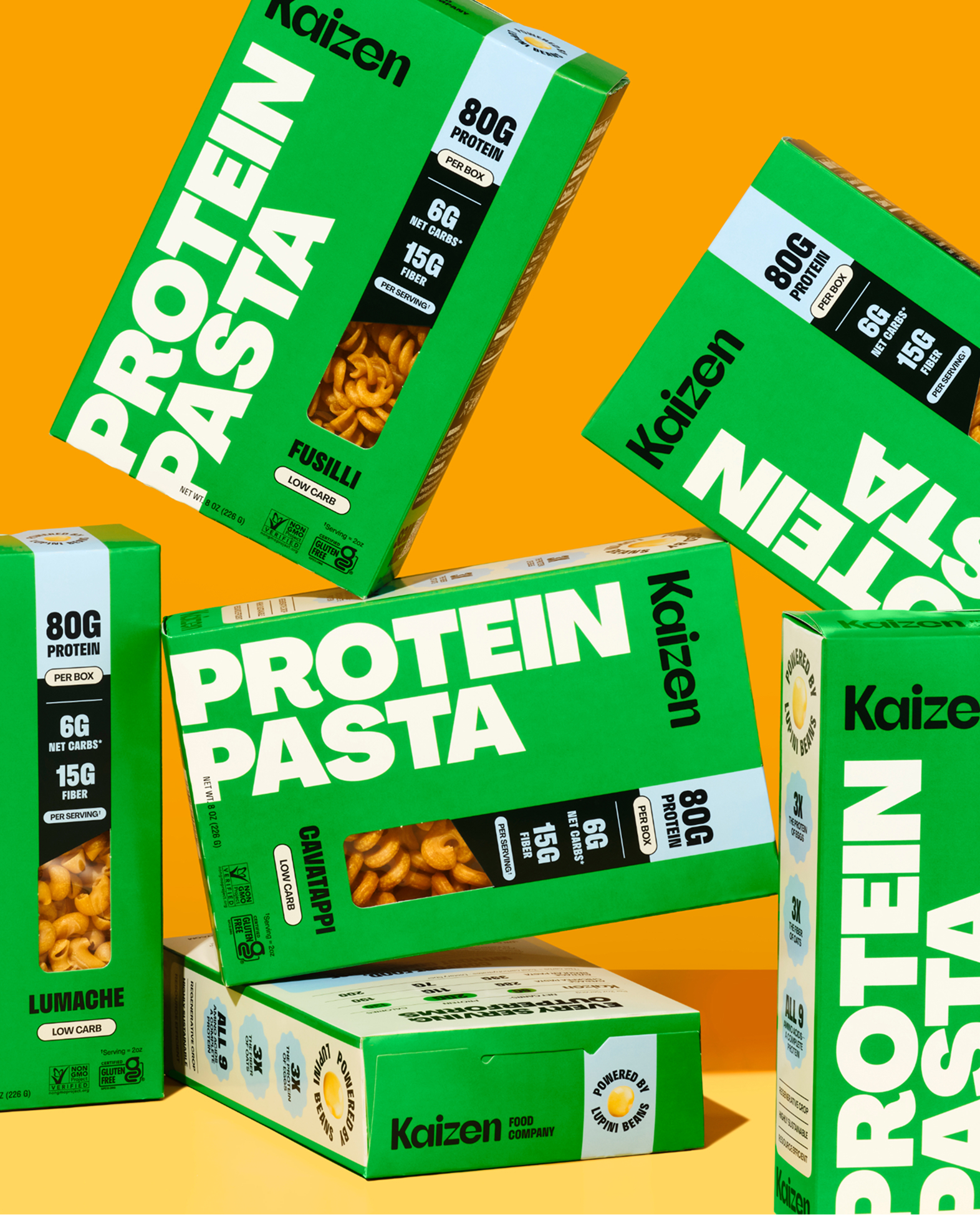
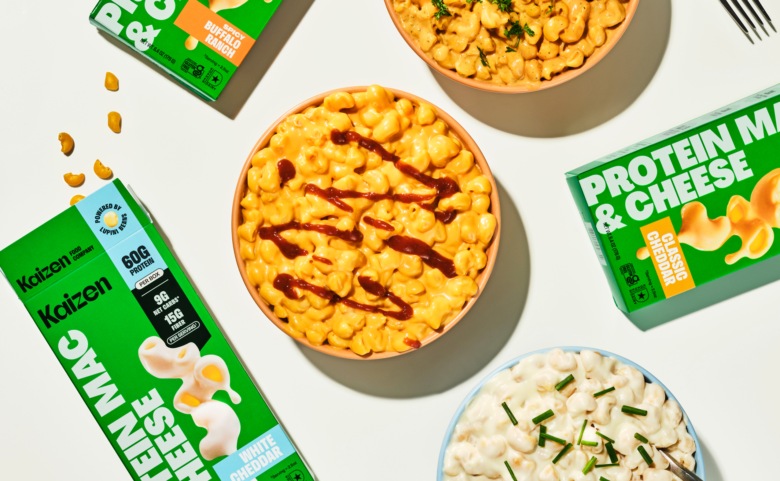
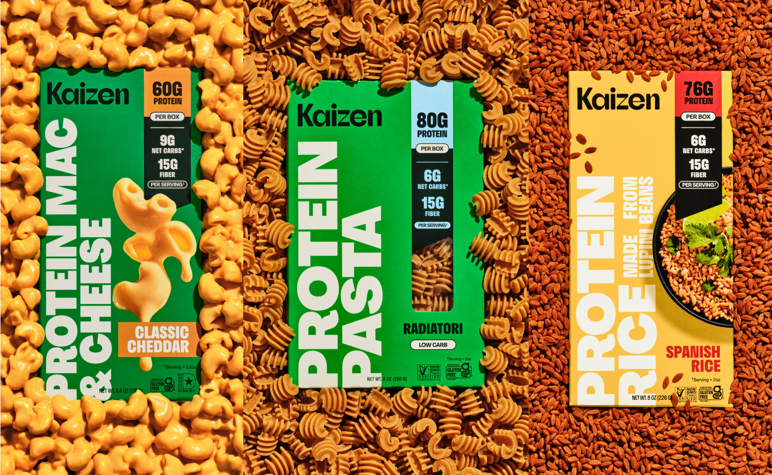
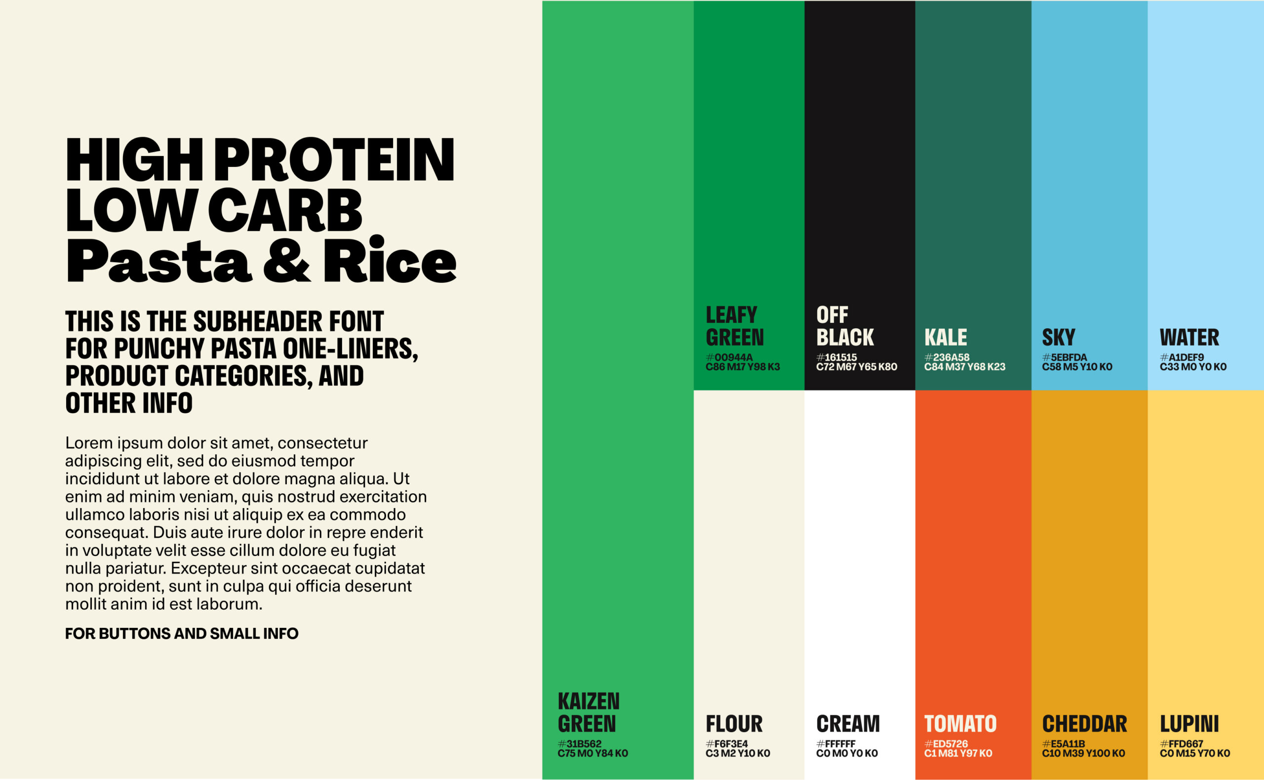
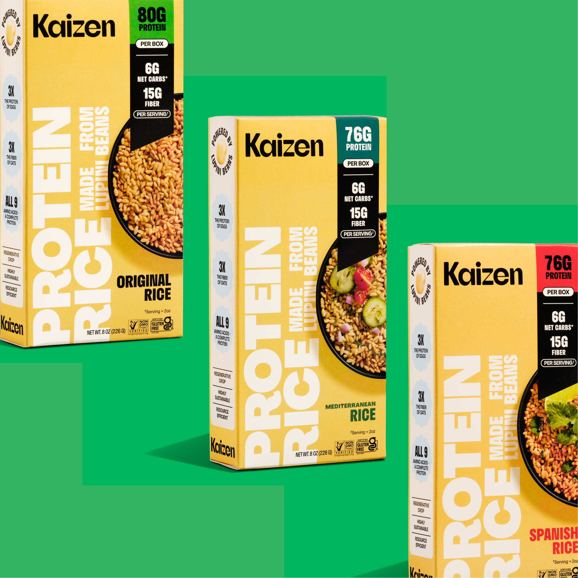
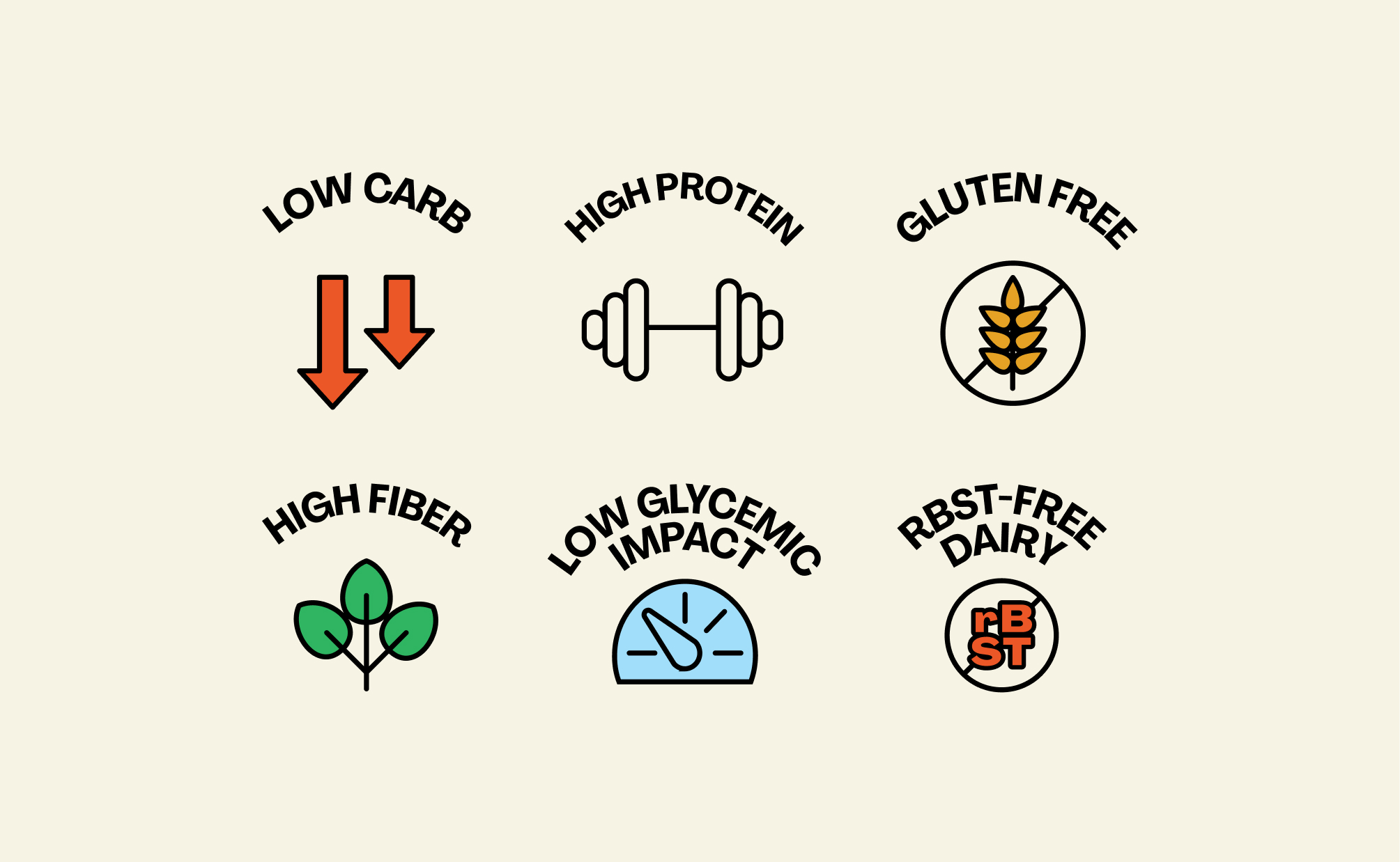
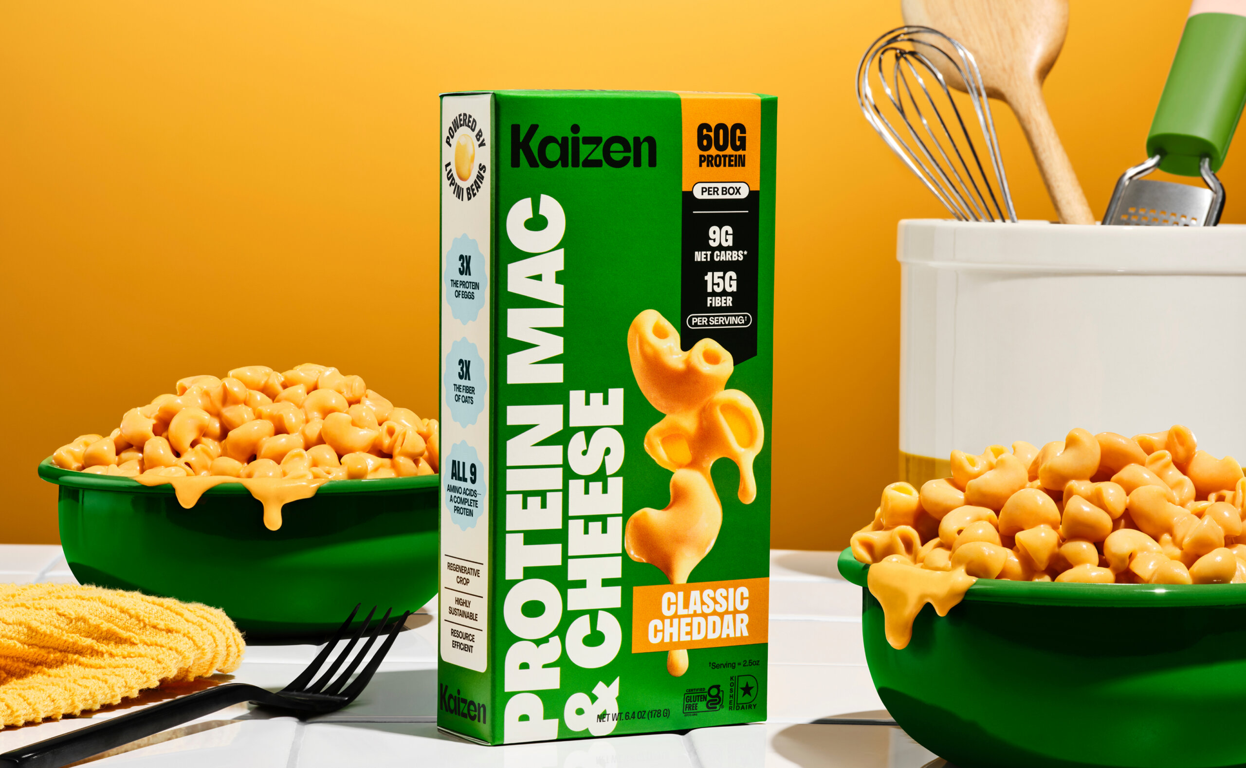
In 2025, following extensive consumer sampling, Kaizen gained critical insight into how shoppers navigated the brand and where friction existed in understanding its value. This research showed that shoppers were most motivated by the product’s exceptional nutritional profile: high protein, high fiber, and low carb, but these attributes were previously buried or inconsistently expressed. Edelmade worked alongside the team at Kaizen to update the existing brand and bring it to life with a fully re-designed packaging system - a bold front-of-pack callout system communicates protein, fiber, and net carb values at a glance, transforming nutrition from secondary information into a primary navigational tool. These elements function as both educational cues and brand assets, helping shoppers make faster, more confident decisions. Now, whether it’s pasta, rice, or mac & cheese, every SKU shows up with clarity and confidence.
